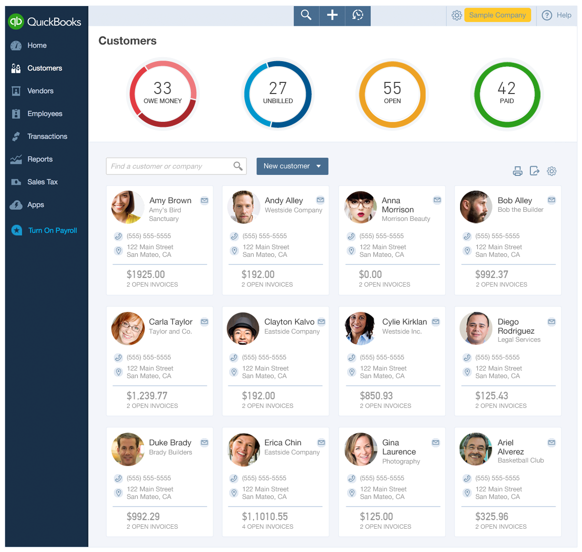
Before redesign - old version with money bar
QuickBooks Online Customer Center: Table and Insights Redesign
The Customer Center is where QBO users, manage their customers. I am the lead designer on this part of QBO.
The top section of the Customer Center provides insights about users' money. Below the insights is the customer list.
Design Goals
Eliminate confusion caused by the “money bar” graphic (shown right). The bar is seen on multiple other pages in the product but has reduced functionality here, and works differently, causing confusion.
Provide relevant insights. We can use data we already have to provide relevant valuable information to users about their customers.
Improve customer list usability. The current list is difficult to scan and sort.
Solution 1: Circular insights, with ability to drill in for more detail
Tile and list views shown
Default Tile View
I decided to use circles to differentiate the insights from the money bar seen elsewhere in the product. I proposed that the circles can also be use to add functionality, allowing users to drill down into specific data points about their money.
I've added a tile view for the data table, allowing for more customers to be shown above the fold. This new tile layout is friendlier and more inviting and will work well on a mobile device.

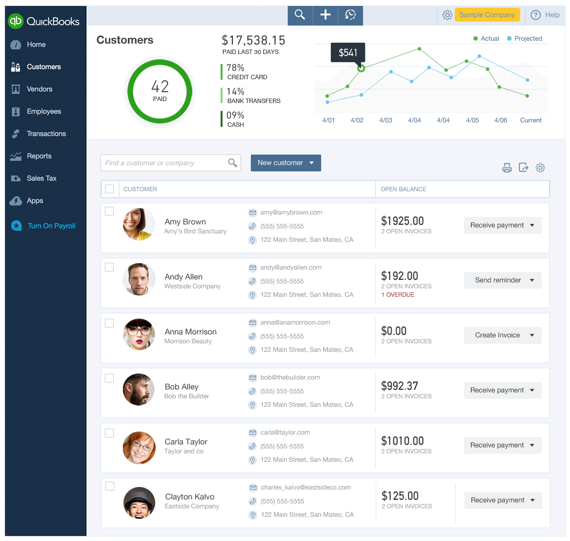
Tile View Drill into Details Example 1 (top section)
The top section of this screen shows users the (drill into) details view about money owed accessed by clicking the red circle in the
previous view.
I selected several key metrics to summarize as graphics, including number of customers who owe different amounts of money, how much of that money is overdue, and a call out of those that are more than 90 days overdue.

List View
I designed a fresh list view that is more consistent with the corresponding tile view. It's easily scannable and highlights the calls to action.
Tile View Drill into Details Example 2 (top section)
This second insight drill in focuses on paid customers. I am leveraging data we already have to provide additional value to users by showing payment types and actual vs. projected performance
Solution 2: Customer insights as tiles
In this version I explored options that stay closer to the current product, and I cleaned up the current table by standardizing row heights and fonts to one size.
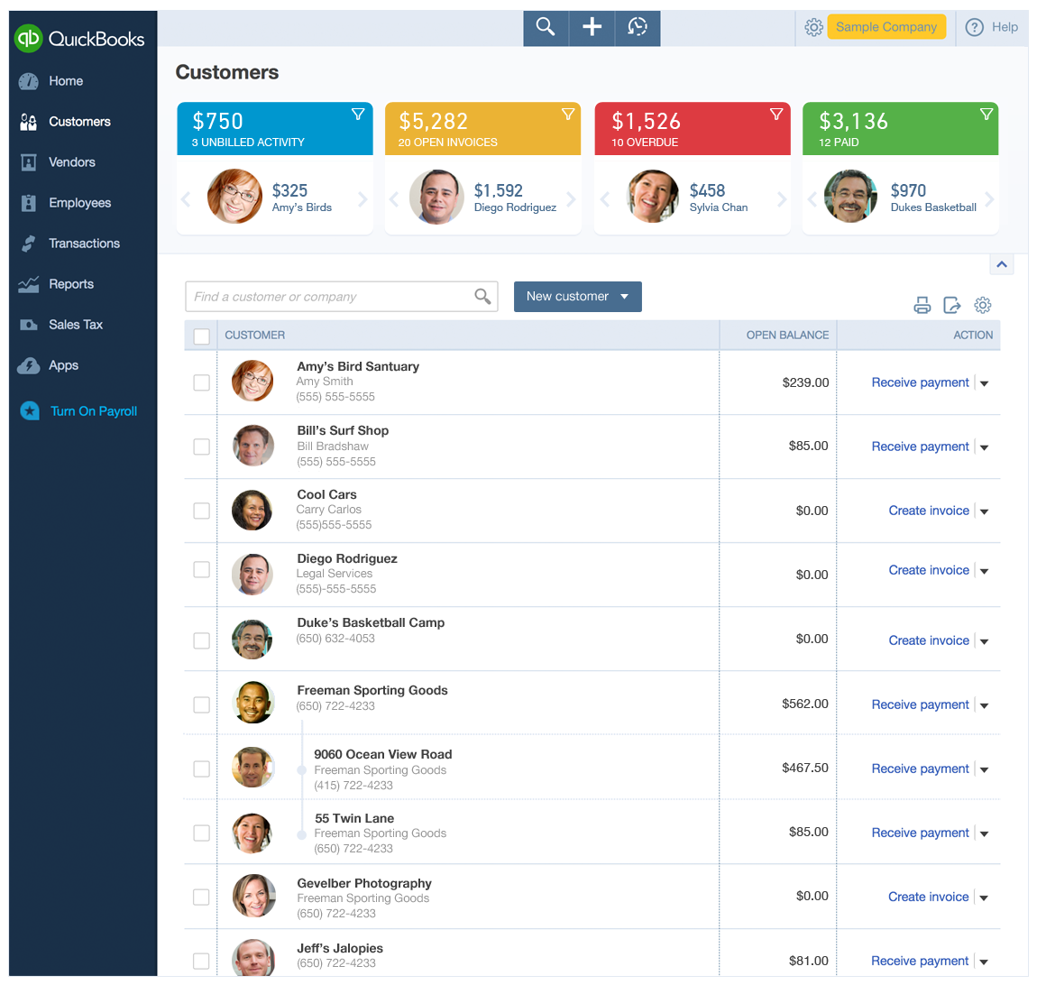
Customer Insights: Tiles Concept 1
In this concept, I chose to explore a tile view that maintains the information of the original money bar, while also allowing users to see the customers in each category.
I cleaned up the customer list by standardizing row heights and font sizes, and show the connection of different locations from the same customer, using a table nesting style.
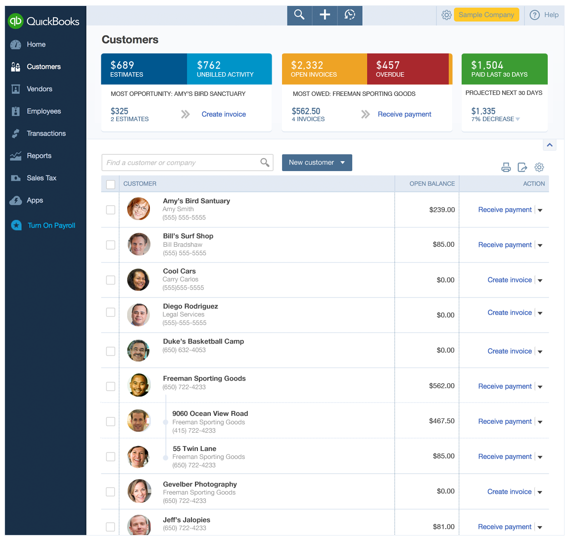
Customer Insights: Tiles Concept 2
Here I created an action-oriented option for the insight section at the top of the page. This also maintains the information in the original money bar, but serves up the call to action that is most valuable for each category.
Table Clean Up Solutions
These explorations focused solely on the table design.
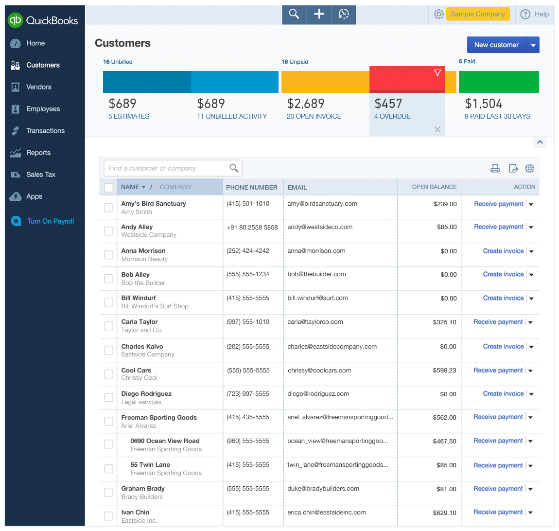
Table Clean up Solution 1
Here I’ve broken up the customer contact information into separate columns, making it easier to scan and sort, (see the “Before” image at the top of this case study for what it looked like previously).
I also designed a new way to sort a 2-line column using the column header.
* This table redesign went live!
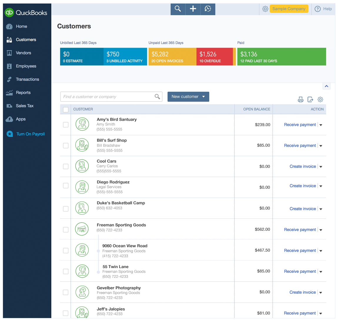
Table Clean up Solution 2
As real customer photos couldn’t be used (we didn’t have the technical resource to build the upload and storage needed),
I explored the use of avatars in the list.
A LOOK AT THE PROCESS
The process begins with sketches, and goes broad first to go narrow later.