
PlanIQ
I designed the setup flow of a new Anaplan feature that empowers planners with super-charged forecasting powered by AI/ML. My design led to 30 customers onboarded in the first 6 months after launch.
In the process, I learned the unique user needs with an AI/ML product, and designed new patterns to add to Anaplan’s design system.

MY ROLE
LEAD DESIGNER
I was the solo designer from concept to completion.
RESPONSIBILITIES
UI/UX design
Visual design
Interaction design
Prototyping
UX writing (collaborated)
UX research (collaborated)
DESIGN TOOLS
Sketch, Figma, InVision
TEAM
I collaborated with:
1 PM
1 Lead Engineer
5 Front End Engineers
1 QA Engineer
2 UXRs
1 Technical writer
1 Illustrator
PROJECT DURATION
2+ years design and development
1+ year maintenance + iterations
PLAN IQ OVERVIEW
Traditional statistical forecasting methods don’t measure up when massive and dynamic enterprise data is involved. Given the dependency on historical data, one market shift and planners have to re-forecast from scratch.
With AI/ML deployed, planners could model multiple scenarios to shape future demand across a variety of industries and use cases. They could also speed analysis, optimize plans, and eliminate the need to re-forecast when market shifts or outlier events happen.
This extreme value-to-customer, is why Anaplan chose PlanIQ as it’s first large scale AI/ML offering.
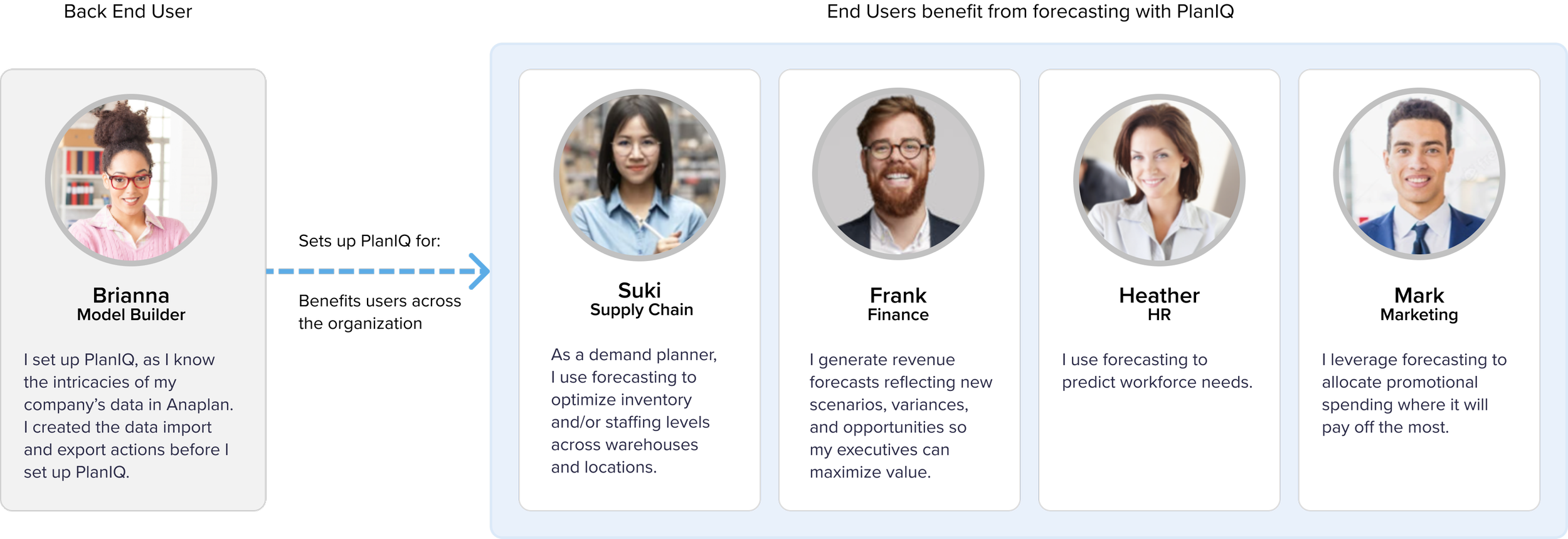
PERSONAS AND USER BENEFITS
The PlanIQ experience starts with model builders (back end / administrative users who are most familiar with their company’s data). They set up PlanIQ so that end users, planners, analysts, and decision makers could reap the benefits. After setup, end users views their AI/ML powered forecasts on Anaplan’s existing dashboard pages.
DESIGN CHALLENGES
1 Designing a framework
2 Evolving a traditional “stepper wizard” to speed up time to value
3 Connecting three flows separated by a technical time delay into one experience
4 Addressing research learnings:
Guidance
Importing external data
Explainability

DESIGNING A FRAMEWORK
Goals and considerations:
Familiar: a left navigation and right content area are typical for enterprise apps. The more familiar, the less time users will spend.
Re-usable: establish a consistent flow to aid in ease-of-use.
Expandable: A way to dig into details, or to hide them when searching for a specific object.
Cohesive: Lives in Anaplan; I worked closely with our design system team to standardize modal sizes, modal content, and inventory page layout.

APPLYING THE FRAMEWORK
PlanIQ’s many screens and states with the framework applied, shown as user flows. High res version available by request.
DESIGNING THE TABBED MODAL
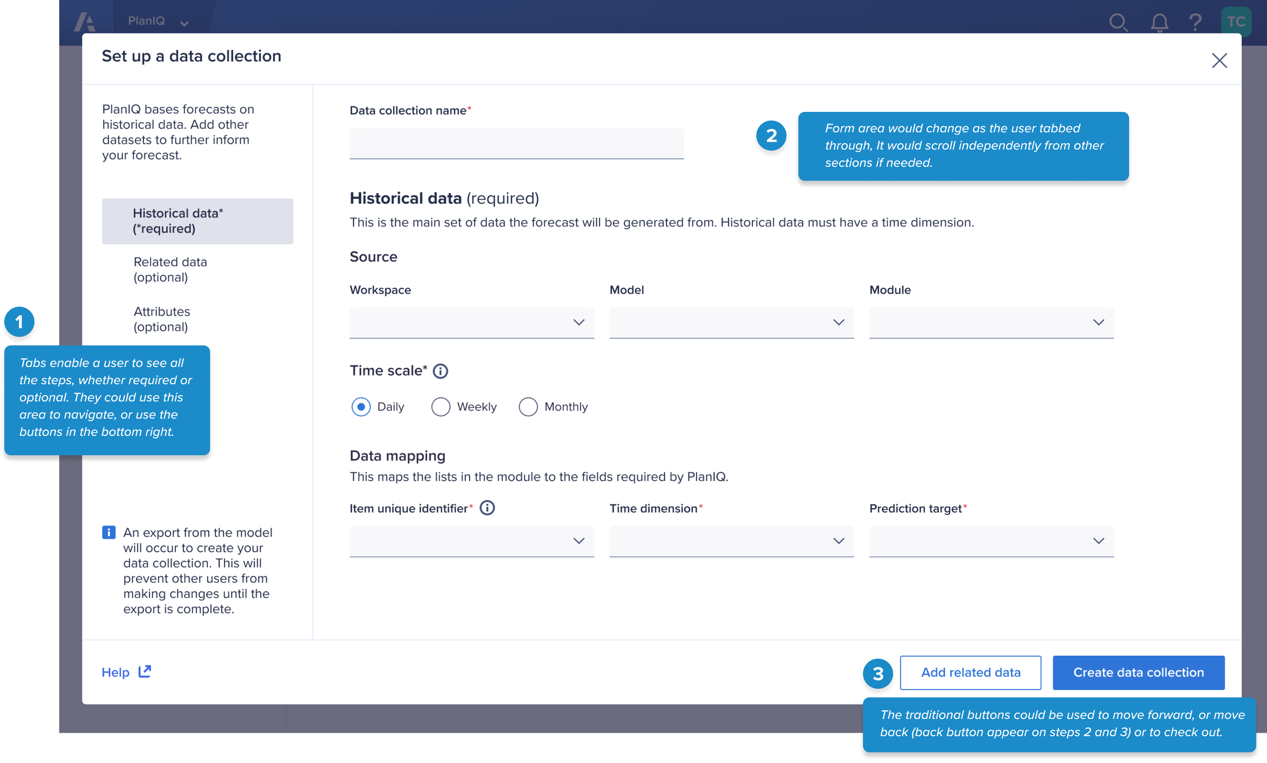
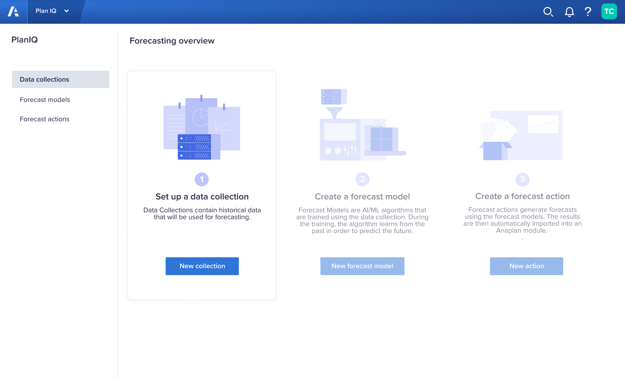
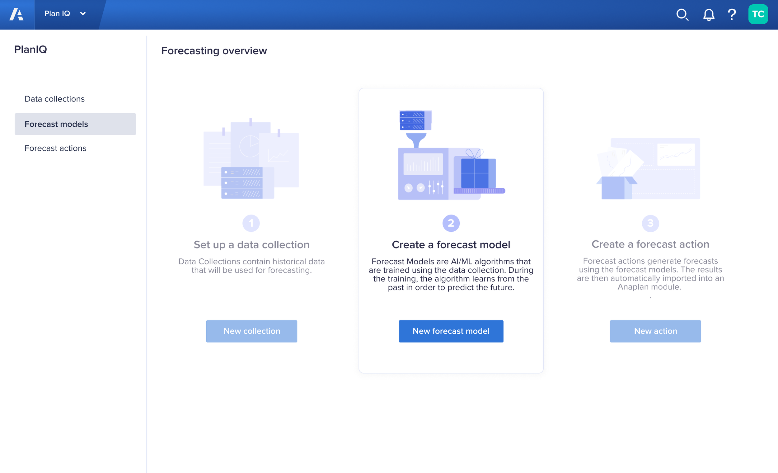
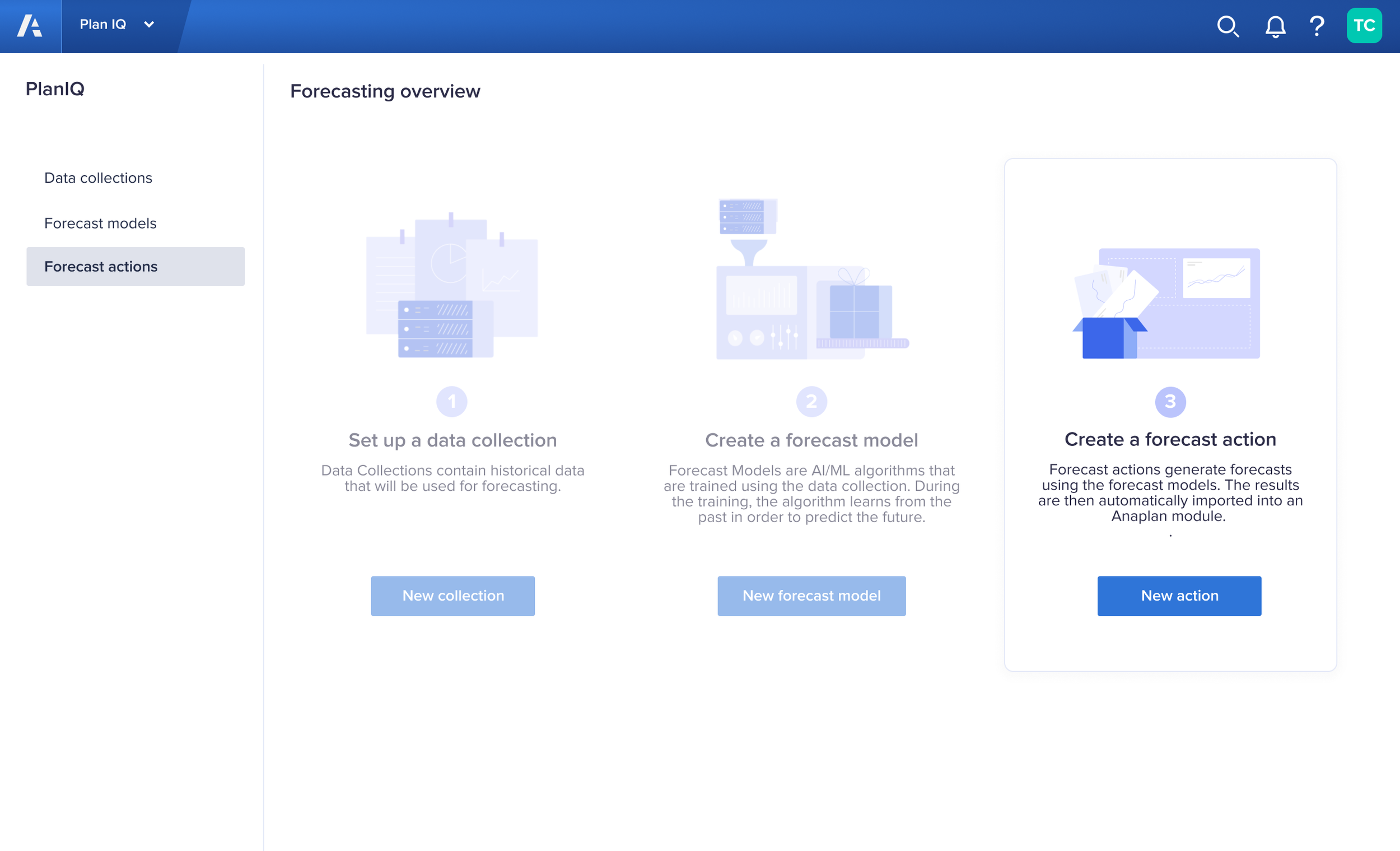
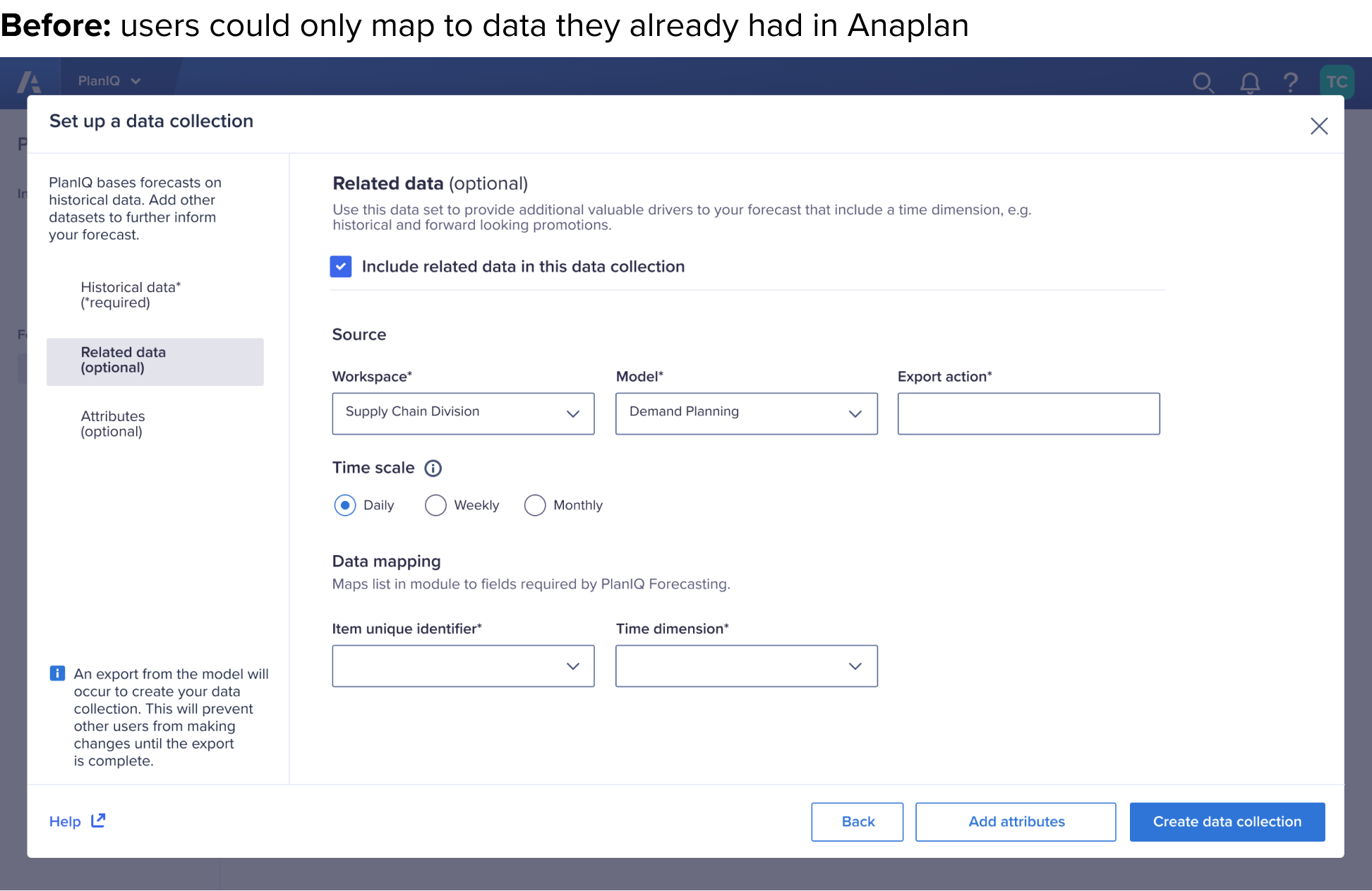
As the first step of setting up PlanIQ, model builders had to connect their company data from Anaplan models to PlanIQ. Only “historical data” was required, but they could make their machine learning model more robust by optionally providing additional data sets. This presented a unique challenge.
My initial explorations were:
A traditional 1-2-3 wizard stepper
Using accordions for the optional datasets, with them defaulting to closed
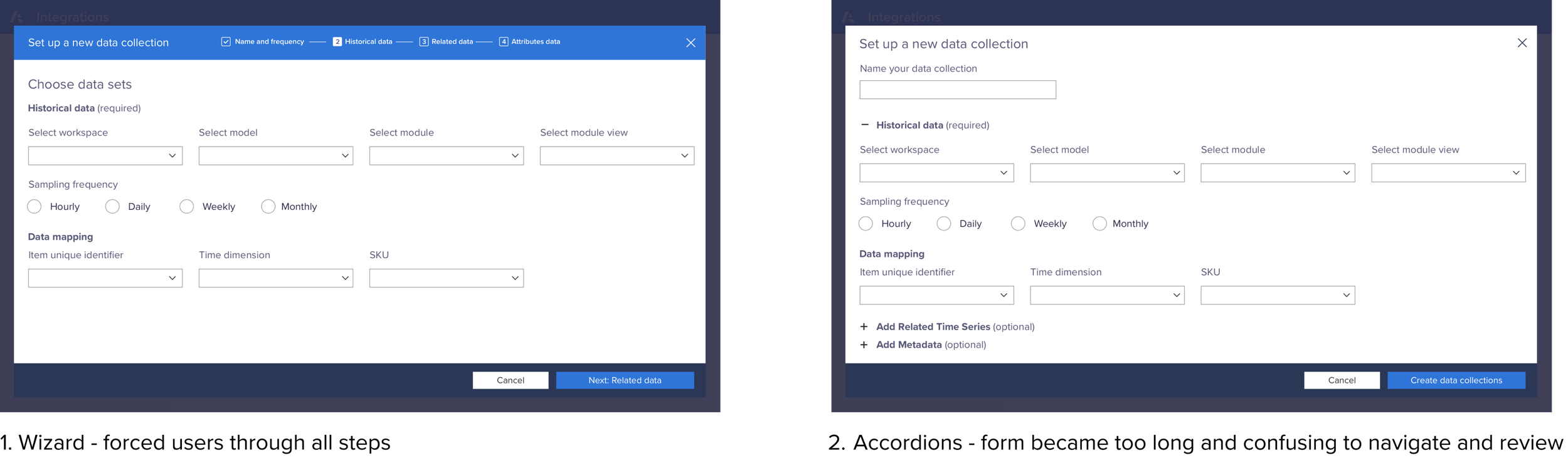
These didn’t work because:
The wizard would force users through all 3 steps, which would be a waste of their time and add unnecessary cognitive load
The accordions quickly broke down because the form got too long as the PM added requirements
FINAL SOLUTION
To solve for this unique scenario, I designed the Tabbed Modal which provided the steps as navigation on the left, and clearly stated which were optional.
This enabled the user to ”Choose your own adventure”. They could fill out only the required section and then check out, or they could fill out any number of the optional sections and check out when they wanted. By enabling them to fill out only the minimum, I sped up time to value.
CONNECTING THREE FLOWS SEPARATED BY A TECHNICAL TIME DEALY INTO ONE EXPERIENCE
PROBLEM
In an ideal scenario, a user would complete all 3 sections in one go:
data collections,
forecast models, and
forecast actions.
In each step, the user would create an object. They would then need this object to complete the succeeding step. However, once a user would finish a step, the back end would take 20 minutes to hours
to create an object.
This created three disjointed experiences.
SOLUTION
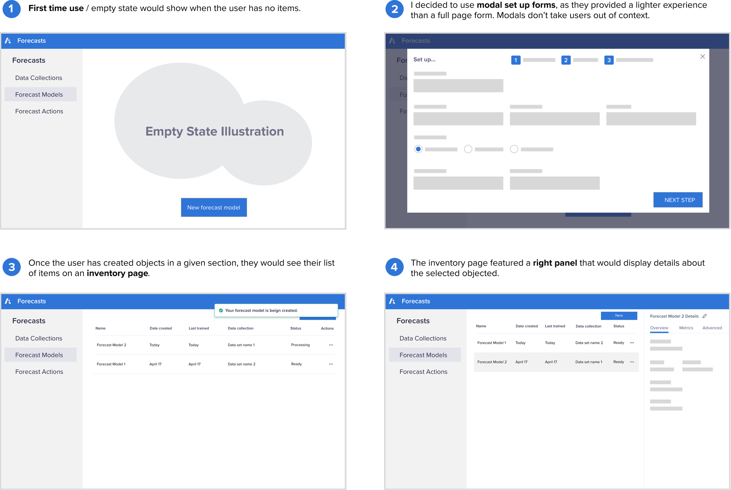
To solve for this I designed the first time use / empty state page to
illustrate and explain the end-to-end story.
Depending on which tab in the navigation is selected, only that
item is highlighted.
Once the last object created was ready, the user receives a notification in the global navigation’s bell icon.
Click through below to see how the first time use state would help the user understand how the story is connected and what step they are on.
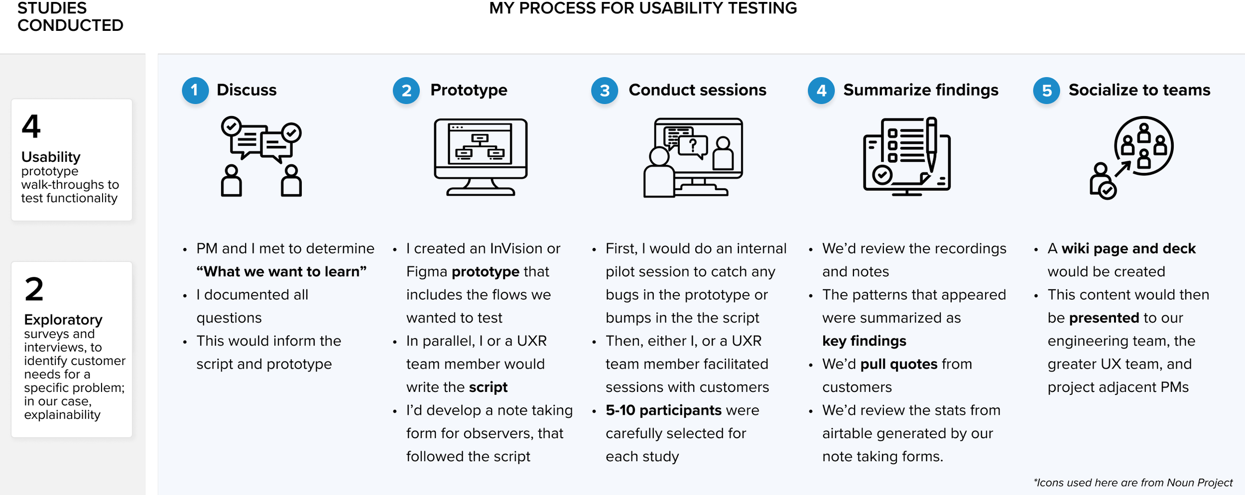
PROCESS AND COLLABORATION
I sketched my ideas for the illustrations.
Then, created a mood board, using illustrations from the web I thought would both match the style and be cohesive with illustrations elsewhere in Anaplan.
I passed these off to the illustrator, and we worked together on iterations until she created the final images.
Once the illustrations were complete, I worked with a technical writer and my PM to come up with the text.
RESEARCH
A Few Key Findings from Research
STUDY 1 & 2: Users needed much more help and explanation along the way.
STUDY 2 & 3: The design framework passed the usability tests, so no major design changes were needed.
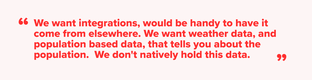
STUDY 3: Users wanted to be able to use integrations to bring in external data that didn’t live in Anaplan.
STUDY 4: Adding multiple data sets of each data type was overly complex, and despite the benefits, the experience was better without it.
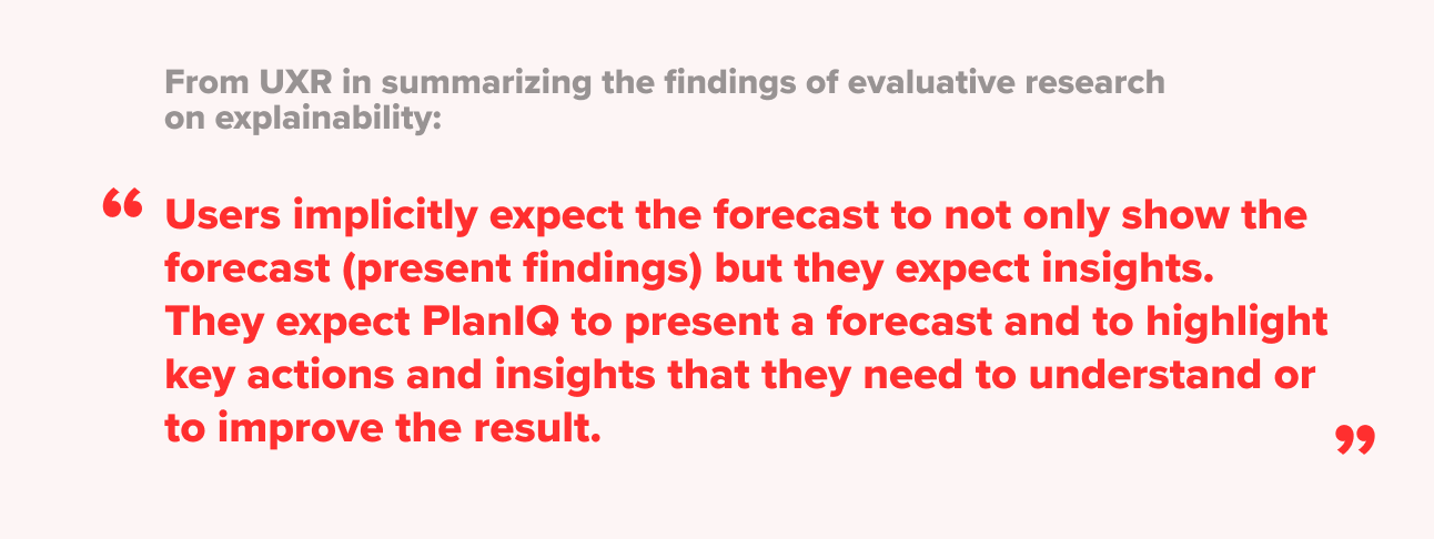
STUDY 5-6: Users wanted to know how the Machine Learning arrived at its results, and specifically, what factors were considered and how (explainability).
ADDRESSING USER FEEDBACK: USERS NEED MORE HELP AND GUIDANCE
Adding more guidance throughout was critical, especially as this was a new feature and newer technology.
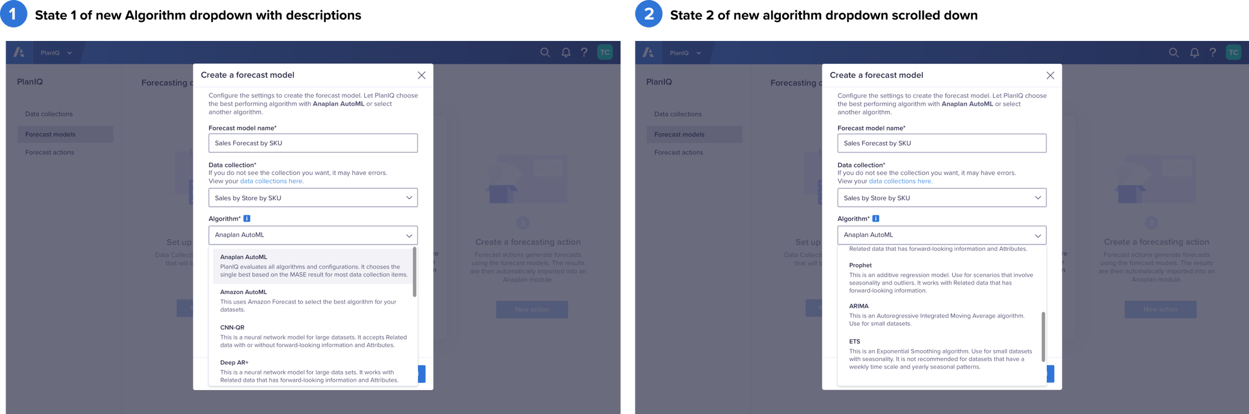
As ML is relatively new, one of the challenges was moving away from tech-speak to more accessible language.
Before research: we relied on a tool tip with a link to take users to our help center wiki to learn about algorithms.
After reseach: I added helpful descriptions directly into the dropdown. By doing so I reduced the need for the cumbersome back-and-forth experience shown above.
This was not an existing pattern in our design system and I worked with the team to add it. We retained the tooltip experience for users who wanted to read in depth.
Note: This is only one example of many where we improved help and guidance post-research.
ADDRESSING FEEDBACK: USERS NEED EXPLAINABILITY
What is explainability?
Explainability is showing the user how the ML model arrived at its prediction. Influencing factors, for example, show the user which factors the model used and how heavily it weighted each one.
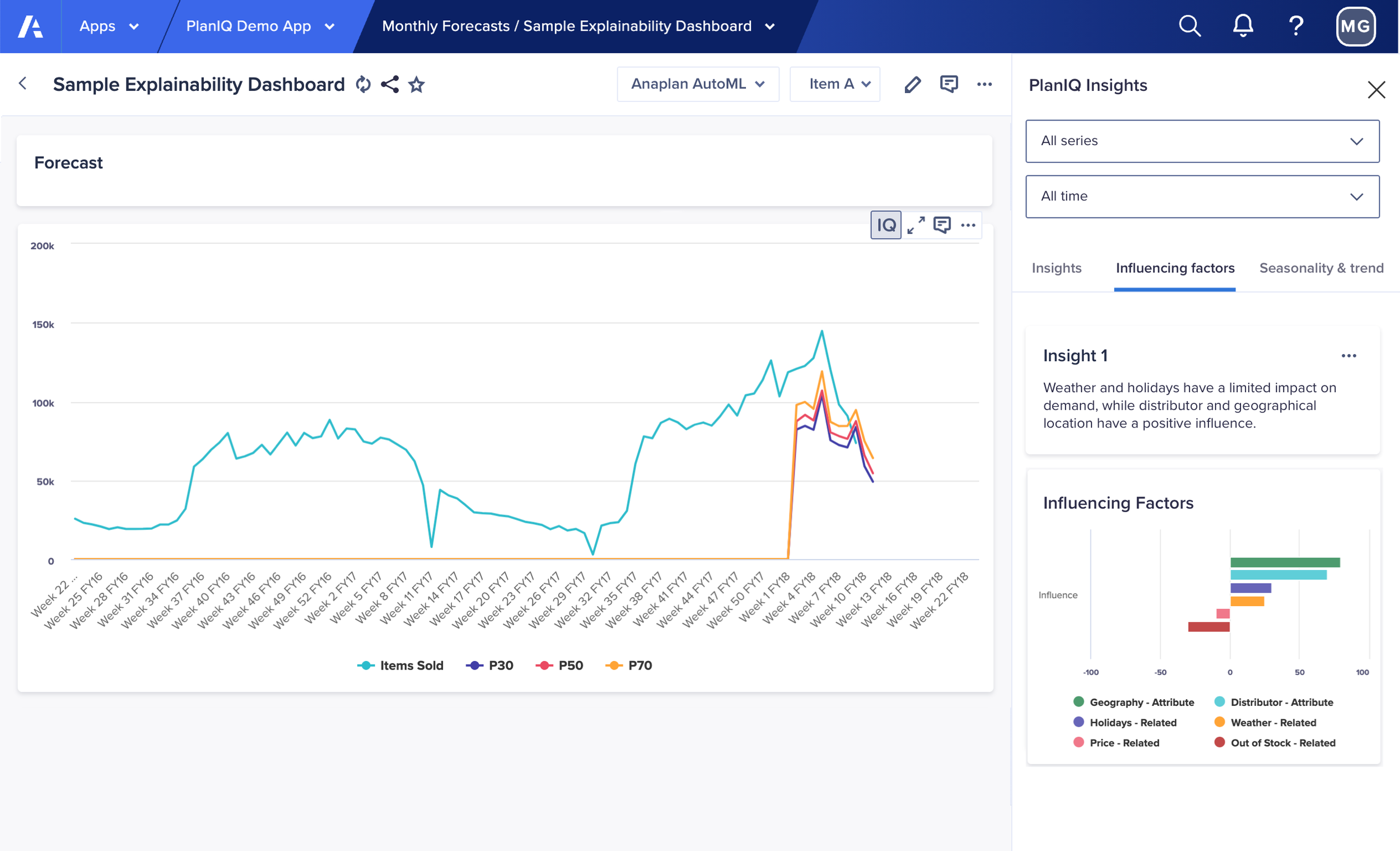
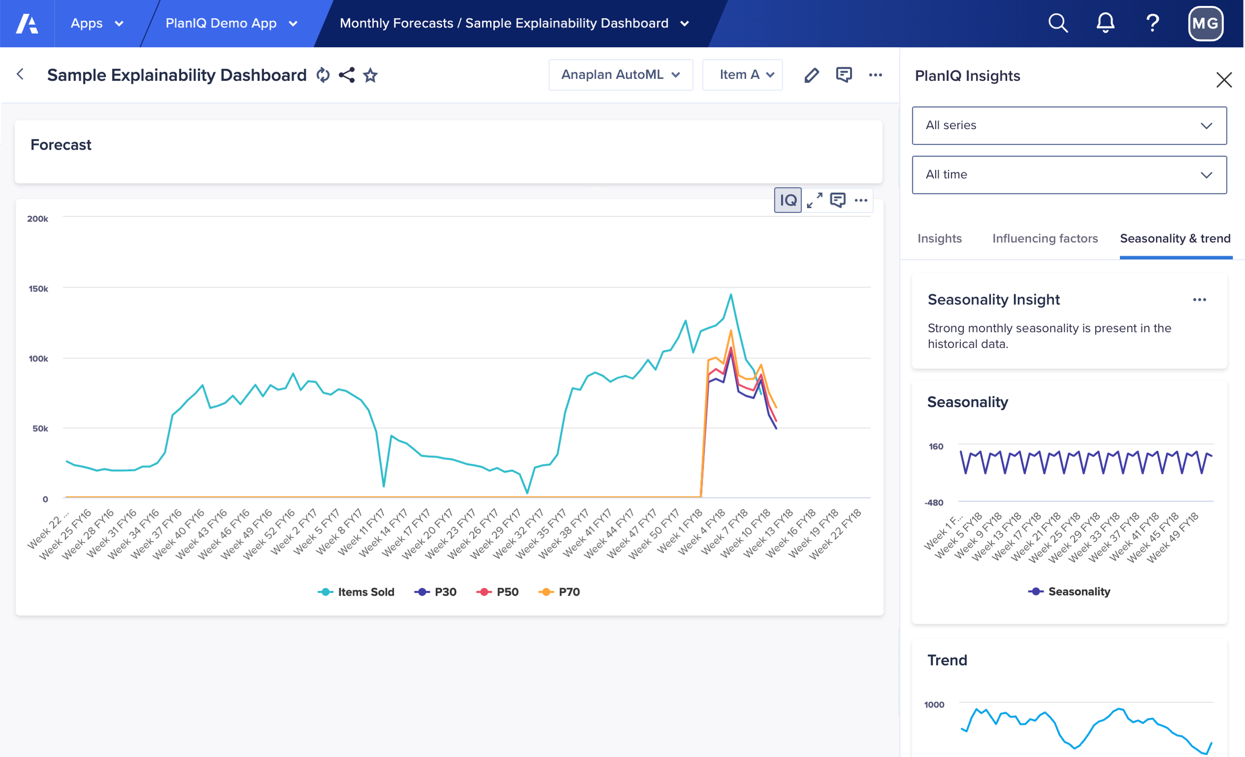
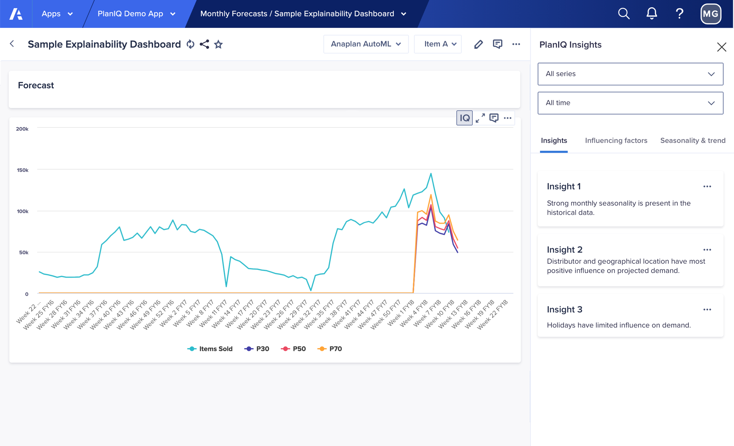
How it works in PlanIQ:
We added a new “IQ” icon to chart options, (that appear on hover), where
a user could pull up insights about their forecast in the right panel.
The first panel, titled “Insights” uses AI-generated natural language to summarize the results.
Solutions
We added tool tips throughout; I worked closely with a writer to improve the explanatory text.
We beefed up our Help Center content to provide even more step-by-step instructions, and added context-aware links to this content throughout.
We added the ability for users to bring data in from external integrations for “related” and “attributes” data.
We discarded the designs for multiple data set types.
We added “seasonality” and “trend” charts as well as “influencing factors” where a user could see what factors weighed how in the calculations.
We avoided using terms like “model training” as research showed that it confused some users, (although it still made it in a couple places).
We leaned towards more accessible text, such as “learning” instead of training.
Refining language and adding guidance was a major part of our efforts early on.
ADDRESSING USER FEEDBACK: USING DATA FROM EXTERNAL SOURCES
Users wanted to be able to bypass the complexity of bringing data into Anaplan and some users wanted to use 3rd party data.
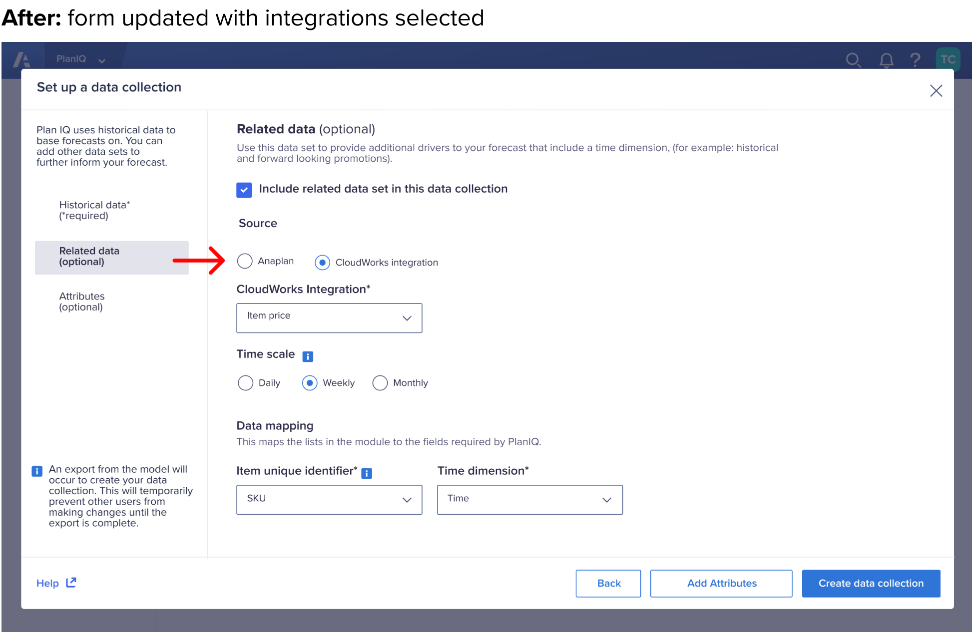
I designed a flow in our integrations feature (CloudWorks) so users’ external data would be properly mapped for PlanIQ to read, interpret, and use. (not shown)
I updated the forms for “Related data” and “Attributes” to allow users to choose “integrations”. (shown below)
I designed the form to automatically update if “Integrations” was selected.
FINAL NOTES ON RESEARCH
Research plays a critical part in informing the designs. This is only a summary
of several key findings and how we addressed them. There were many others that led us to 30 paying customers in the first 6 months after launch.
PlanIQ was a game-changer for our customers, and we heard this repeatedly.
All feedback was recorded and prioritized, most of it was designed for, and much of it was built and launched!


IN CONCLUSION ON AI/ML, I LEARNED…
Research is critical, just like with any other traditional product or feature.
Explainability is key for users to trust ML and the results it produces.
Friendly visuals help guide users through the experience.
More help, guidance and explanation is better than less, but have ways for users to reveal it as needed so as not to over-clutter the UI.
Having a well-written wiki/help documentation is also critical.
Our customers visited this a lot.Users need visibility into the data they input into the system, and ways to troubleshoot or exclude bad data.
We explored many solutions for this, but ultimately didn’t land on one and weren’t resourced to complete this piece.
It’s good practice to provide a way for users to provide their feedback directly to the system.
Continue to explore ways to understand:
Did the ML produced what was expected?
How accurate was it?
What are the different ways can we measure accuracy?
How can we get feedback in line?